Feb 27, 2022
Concept: Create your visual content for web 70% faster (#3)
Motivation
With the cross-browser support of CSS's aspect-ratio property now widely available (Link) and the global coverage is quite high (caniuse) it's the perfect time to leverage this feature for your website or product.
The goal is to streamline your daily workflow in creating visuals by reducing the number of assets you need to produce. Why not adopt a size that's easily reusable? This applies whether you're designing for your social media channels or your website.
Repetitive work
Besides of creating visuals and content for your Website, you also have to check the image specs of your various social media channels:
Are there new features that need new images, including new sizes?
How many images do we need to create for a campaign if we want to display it in several social media channels?
Have the sizes changed?
Are there new social media platforms that marketing would like to tap into?
Why am I finding different pixels sizes for the same asset (cover, profile photo)?
Unfortunately other sites are displacing the official guides through googles ads. So these are often used instead. So I uses them as well for my concept of proof. Therefore, it may happen that the resolutions I list in this article are not always correct to the official resolutions. I have added links to the official guide at the end of this post.

How do other domains approach size and resolution standards?
Several domains have established standards for sizes and resolutions:
Web Video Resolutions: These typically include 240p, 360p, 480p, 720p, 1080p, 1440p, etc. Most of these adhere to aspect ratios like 16:9 or 19:10.
TV & Cinema Aspect Ratios: Common ratios include 3:2, 4:3, 5:4, 16:9, 16:10, 21:9, among others.
Photography Aspect Ratios: These often encompass 4:3, 3:2, 16:9, 5:3, 5:4, 1:1, and so on.
Paper Size Ratios: These follow standards like DIN A6, DIN A5, DIN A4, DIN A3, DIN A2, DIN A1, and for specific needs, there's US Letter.
Web Content Image Sizes: Currently, these are quite diverse and lack a standardized approach.
Challenge
Develop a standardized image size system to not only reduce overhead but also ensure scalability. This system will allow for the reuse of assets across various marketing campaigns on multiple social media platforms. It will also facilitate expansion to new social platforms. Moreover, with the support of the CSS 'aspect-ratio', it's now even more efficient for website design.
So I tried to collect all image sizes for the following six platforms:
Facebook
Instagram
Twitter
Linkedin
Printest
Youtube
Even though I have not covered all social media platforms, the system aims to work for other platforms as well.
Collecting image sizes

While collecting the image sizes, it quickly became apparent that quite a few images already follow an aspect ratio.
So I converted all other sizes into an aspect ratio as well. Of course, some images will now turn out larger than intentional required. So I checked, for each platform, how much will be cut off due to the “incorrect” size.
Even some of the official guidelines cannot guarantee that your visuals will be displayed 100% correctly. Therefore, often previews are provided while uploading images.

So I used the safe area (television) method. Which divides the image into a safe (gray) and unsafe (red) area. It basically tells you what your viewers will definitely see and what potentially will be cut off, depending on the TV device they are using. The same method can be applied to web users (mobile, tablet, desktop, etc.) as well.
Safe area check

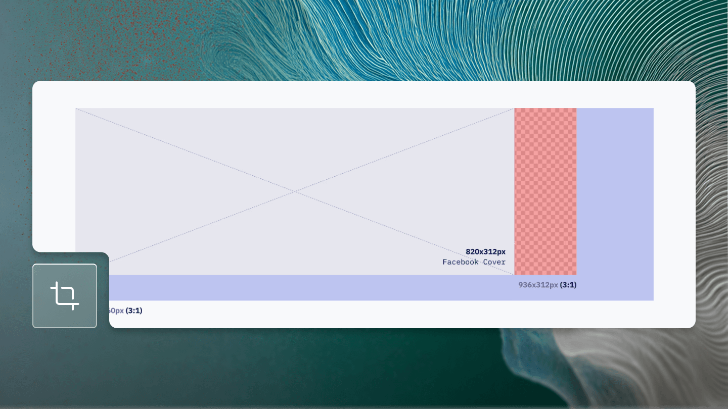
According to external guides, Facebook follows almost no system. So most of the content will be cut off when using an aspect ratio. But still within a reasonable range in my opinion.

Facebook can be covered with five aspect ratios: 1:1, 2:1, 3:1, 9:16, 16:9.
Safe area check

As we can see there is not that much content being cut off when using an aspect ratio.

Instagram can be reduced to four aspect ratios: 1:1, 2:1, 4:5, 9:16.
Safe area check


Twitter can be covered with four aspect ratios: 1:1, 2:1, 3:1, 16:9. The same we are already using for Facebook as well - Nice!
Safe area check

Images using the same resolution are merged. So you only see two adjustments instead of three.

Linkedin can be covered with four aspect-ratios: 1:1, 2:1, 3:1, 4:1.
Safe area check

Pintrest

Pintrest can be covered with four aspect-ratios: 1:1, 1:2, 2:3, 9:16.
Safe area check

Youtube
Youtube didn’t need any adjustments.

Youtube can be covered with two aspect-ratios: 1:1, 16:9.
Safe area check

Conclusion
Adopting standardized aspect ratios for visual content streamlines your workflow, reduces the number of required assets, and ensures consistency across platforms. This approach simplifies the creation process, saving time and effort while enhancing scalability and adaptability for future platforms.
By focusing on aspect ratios, you can prioritize creativity and strategy over technical details. Always refer to official platform guides for accuracy, but leverage the efficiency and simplicity that aspect ratios offer for faster, high-quality visual content creation.
At the end it’s up the your team if you still want to go “pixel perfect”. Even so there is no such thing. It will just cause a lot of headache and overhead in my opinion.

With Facebook coverage, there is only little work left to do for other platforms. Youtube and Twitter are already completely covered for example.

Besides, try to ignore external sources which are trying to tell you the sizes you need. Always go with the platform guide.