28 Feb 2022
Organizing & enabling your design team within Figma (#4)
Motivation
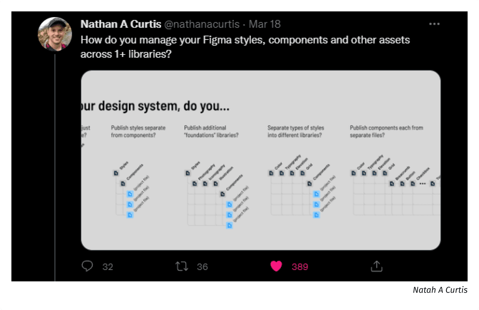
Enabling teams to deliver quickly. Implementing a Design System can present challenges. Should you pursue a centralized or decentralized design system? How about a hybrid? Depending on how you manage your libraries, achieving scalability is doable. Just recently Nathan A Curtis started a small survey how people manage their Figma libraries: Survey
Repeating challenges and pains
If you want to keep teams as autonomous as possible, then a decentralized design system might be the better choice. However, this brings new challenges if you are aiming for a uniform experience through all products. While a centralized design system can more easily ensure a consistent visual experience, it’s more likely to hinder teams’ autonomy and may slow down delivery.
Challenge
Having teams as autonomous as possible, while securing a uniform experience through all products.
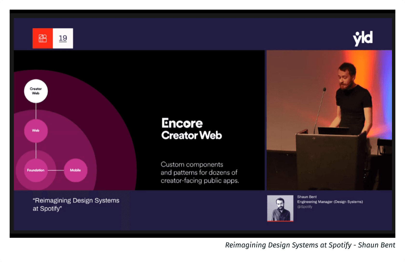
I came across a great talk by Shaunt Bent: Reimagining Design Systems at Spotify. Where he summarizes the advantages and disadvantages of a central and decentral design system. And how they came up with a framework which enables teams to not only build products with it but also contribute to it. Defiantly worth a watch: Link
The Framework
It consists of various parts and works as an organizational layer. The framework documents everything such as: Branding, shared terminologies, patterns, positioning, shared tooling, plugins and more.
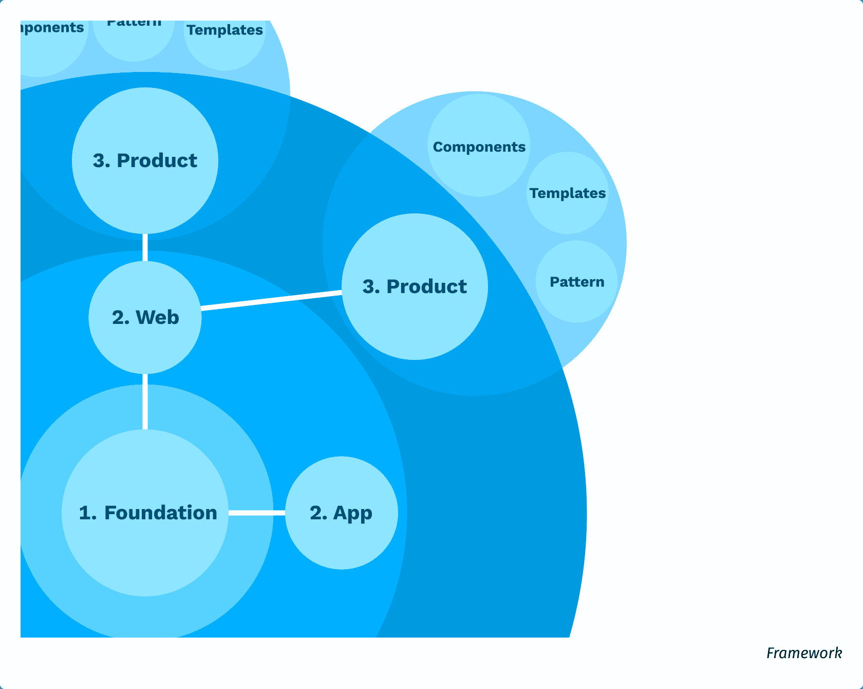
1. Foundation
The core serves as the core and heart of all products. It houses various tokens such as Color, Typography, Spacing, Shadow, and Motion as well as guidelines for writing and accessibility.
2. Web/App Components
All basic components, such as buttons, forms, and dialogs, are built atop tokens, adhering to the guidelines and patterns established in the foundation. Sharing components across technical platforms poses challenges, thus in this scenario, a distinction is made between web and app components.
3. Product
The third layer comprises the product or local design system, where components specific to it are stored. This segregation is crucial to avoid mixing, for instance, consumer and enterprise navigation patterns in the same library. Despite this, all specific product components are built atop the web components and foundation.
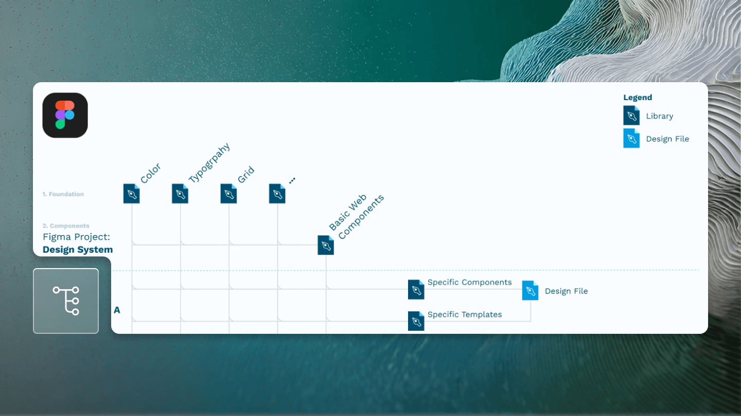
This methodology can also be embraced by your design team within Figma. If your team operates under the Organization or Enterprise license, the feature 'Organization-wide design systems' proves useful.
In the following illustrated example, the foundation is divided into separate 'design token' libraries: Color, Typography, Grid, among others. This division isn't mandatory; it largely hinges on the diversity of your products and the size of your company.

Conclusion
Providing a local Design Systems for each product helps your team to be as autonomous as possible. At the same time, the local library files build on top of the existing framework, which in turn helps the product to appear consistent without having to sacrifice velocity in the process. Especially the design department should have the possibility to quickly and easily build new components without bloating the existing design system.